

FRIGO: Designing with AI
As machine learning is becoming prevalent for consumers in products such as Amazon's Alexa and Google’s Home, opportunities in new kinds of product and service experiences are surfacing. For my Interaction Design unit (2017), our task was to create a home interactive experience based on Artificial Intelligence through iteratively designing and prototyping a solution for our chosen use-case.
My Role
I collaborated with peers Chinmay Kulkarni and Marco Gallo between August-November 2017. My contribution involved interviews, storyboards, research evaluation and video documentation.
Defining the Problem
It’s commonly known food waste exist impacting households, the environment and at large the economy but what’s being done to aid this?
Just Australia alone it has been estimated that food waste costs approximately $20 billion each year as of 2017 where consumers throw away approx. 3.1 million tonnes of food. The Australian government is working towards halving the food waste by 2030 with their National Food Waste strategy that integrates all levels of government, private and non-for-profit sectors and the community. The strategy coincides with the UN’s sustainable development goal of ensuring sustainable consumption and production.
Although such efforts exist already, we wanted to dive deep and understand: Why is there food waste and how can AI reduce it in the home?
Investigation
We conducted interviews and an online survey with questions based on shopping, inventory management and artificial intelligence. We discovered that the problems causing food waste are commonly overstocking, forgetting and having unusable ingredients.

We mapped out all the use-cases through personas and storyboards (problem and solution), resulting in three core concepts.
1. Smart Shopper (S2) is a system that studies its user’s shopping habits and combined with online shopping data, generates an effective personalised shopping list.
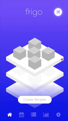
2. Smart Shelf is a shelf system with RFID and weight sensors which allows users to go through the contents of their fridge and explore recipes, without having to be physically there.
3. Food Calendar is an app that recommends a shopper what to buy according to their schedule and shopping data, to avoid overstocking and forgotten food expiring.
Extracted insights
We observed recordings of tests with paper prototypes and discovered:
Users prefer a fluid user-flow (because they just want to get their task done)
Have interaction when/where necessary; streamlined methods (auto scanning camera)
Icon/Symbols should be clear and recognisable. Use existing design languages.
Strong visuals. “Pictures speak a thousand words”. Also adds to the fluidity of the user-flow.
App needs to be easily accessible to be adopted into daily routine
Final Concept
Creating a user flow helped us out of a creative block in finding the perfect chemistry between the concepts (user flow below from our session).


Eaten or Thrown

Added motion

Takeaway
In review of the course, i’ve learnt to:
prototype dirty and smart
user test at depth when you don’t have enough users
sketch out all the possibilities because no idea is a dumb one
discuss complex challenges with your team when in doubt
chunk massive tasks and delegate with team members
